B & W Trend: Minimum Color. Max Style.
December 01, 2017
You can’t make a list of the top five design trends of 2017 and not include black and white. The daring duo has stolen hearts and headlines in the design world for decades. Even Dorothy Draper (the color-happy icon responsible for launching interior design into a venerable profession) had a thing for the small palette as far back as the 1930's. The formidable pair earned its long-loved versatility by swinging classic and sophisticated one minute and modern and edgy the next. By nature and by design, it’s also the contrast between the two shades that makes it so eye-catching (think onyx, penguins, and piano keys). Whether your taste runs marvelously mod, traditional, or any style in between, devotees everywhere are experimenting with this look-for-the-ages with enviable results.
Our devotion to the neutrals becomes palpable in the presence of Scandinavian design. Their strikingly simplistic approach to color proves that black and white can be both restful and high-drama. From floors and countertops to mosaic wall tile, the fearless combo transforms ordinary rooms into timeless and sophisticated spaces.
Still think the iconic look only works in boutique hotels, SOHO lofts, and other chill-to-the-core spaces? We asked Emily Holle, our Director of Trend & Design to share her favorite black and white decorating ideas. No matter where you call home, take a fresh look at the trend. It may surprise you!
Lay Down the Look
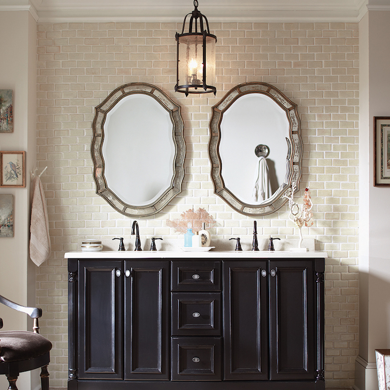 Oh, what a vision of loveliness! Doesn’t Antique White Subway Tile 3x6 make the classiest wall tile ever?
Whether you’re remodeling an itsy-bitsy powder room or a generously-sized master bath, add understated luxe to the space by editing the color scheme, minimizing clutter, and incorporating simple hardware. “A pared-down palette like this is sleek and visually dramatic – especially when you carry the ‘less is more’ philosophy throughout the design. What remains packs a bigger punch – like the black cabinet. Coupled with white subway tile, the aesthetic is fresh and clean,” said Emily.
The Domino Effect
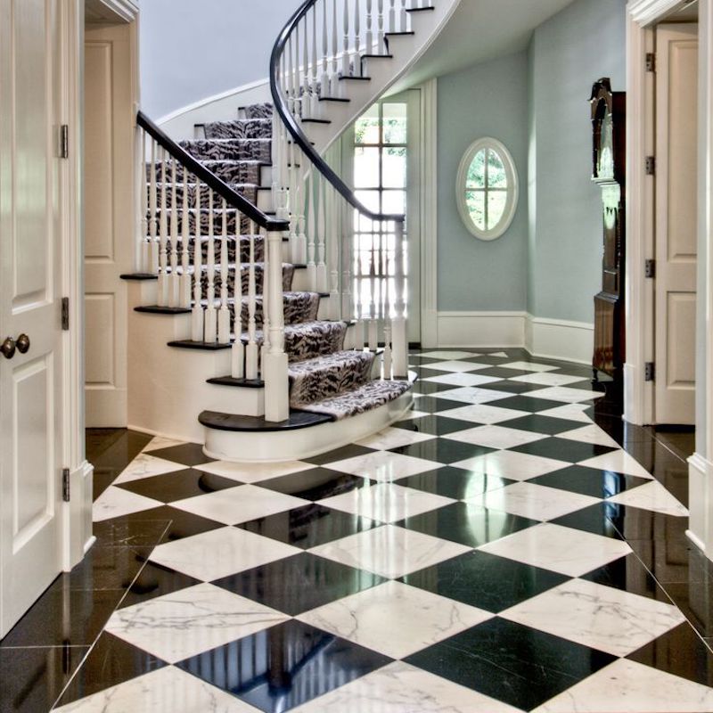 Featured: Pinterest
Thanks to its universal appeal and versatility, black and white checkerboard floors have been a mainstay since the 15th century. “Installed on the diagonal, b&w checkerboard floor tile is the perfect anchor for a black and white schematic – whether that means lending charm to a single-hued bath or adding focus to a large formal space. It’s also ideal for breaking up a narrow hallway or galley kitchen,” said Emily. From an Iowa farmhouse to a Park Avenue classic six, we’ve never seen a checkerboard floor we didn’t love! Feeling adventurous? Get the look with marble or porcelain.
When 3 Outshines 2
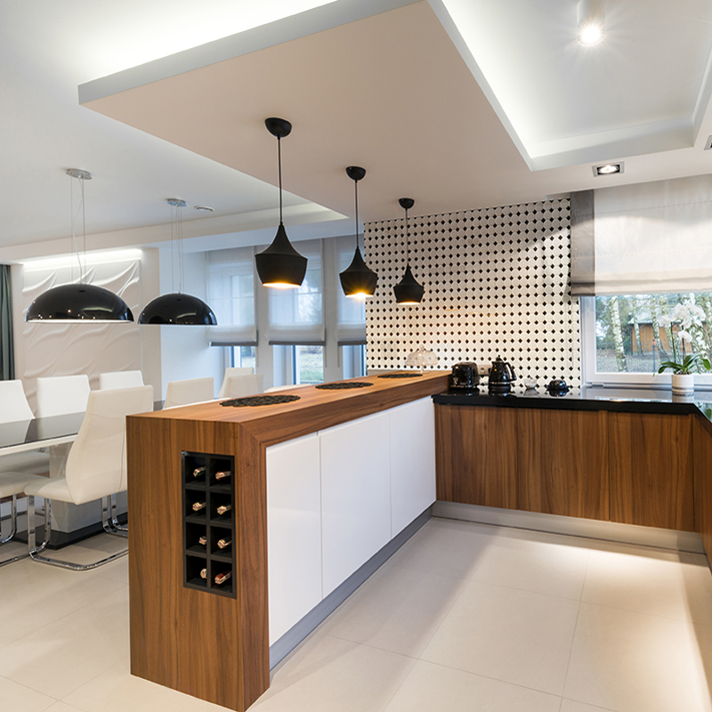 A wall feature decked with White and Black Matte Octagon porcelain tile adds texture and intrigue to this mod kitchen.
Introducing a third color in a black and white room? Set the pair to its best advantage by adding natural wood. “When it’s done well, medium gold wood tones look stunning between the two extremes. It grounds a space and adds an element of natural warmth. In monochromatic design, wood infuses depth and complexity – species with distinctive veins and knots in particular,“ said Emily.
Mix & Mingle
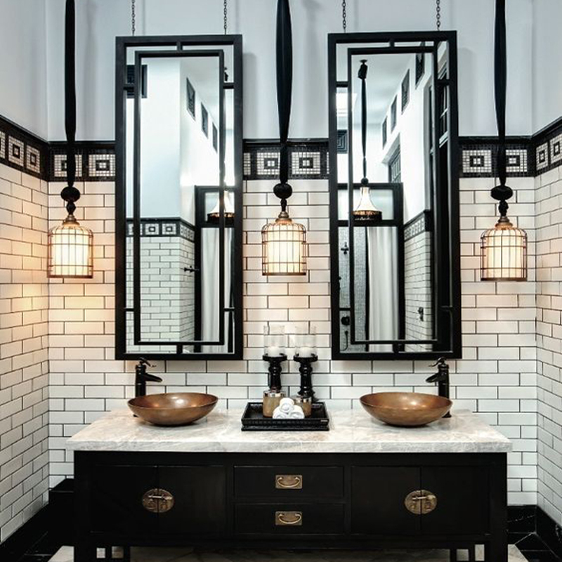 Featured: Pinterest
It’s much easier to incorporate styles from different eras and influences when you have a small flexible palette like black and white. The bonus? It tells an interesting and unexpected story. “There are a lot of design elements at play in this bathroom, but it works because everything curated for this tall and narrow bath has substance: from the subway tile walls and marble floors to the industrial-style sconces and skinny mirrors to the Japanese-inspired cabinet and copper touches. Don’t be afraid to mix and match period pieces,” said Emily.
Tactile Elements
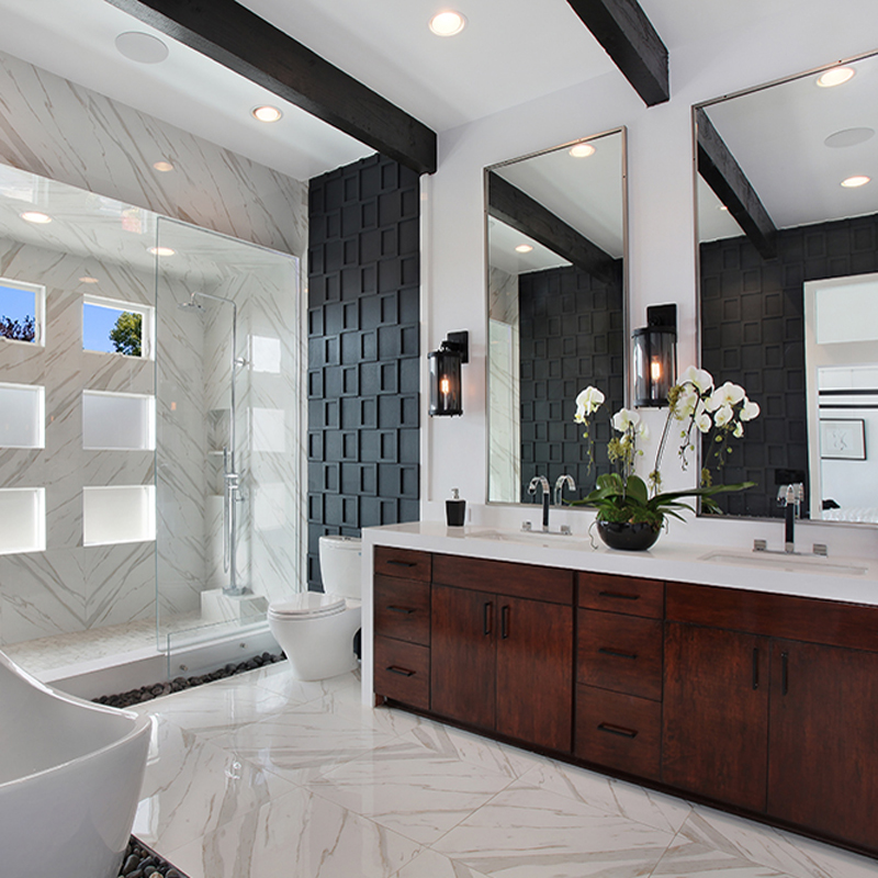 Mahogany cabinetry and a midcentury wall treatment in black pop against the Arctic White Quartz countertop and Pietra Calacatta Porcelain Tile floors and shower surround.
One of our favorite ways to make the most of a black and white room? Play up the texture in both fixed (surfaces, wood, and furniture) and soft (textiles) elements. “From natural stone to metal sconces to wood cabinetry to rich linens, texture elevates a high-contrast space and creates a striking moment.” Emily continues, “If you’re updating floors and walls, and happen to be a fan of grasscloth, take a look at TekTile Porcelain Tile. Its mod tactile aesthetic works beautifully in monochromatic spaces.”
Pattern Play
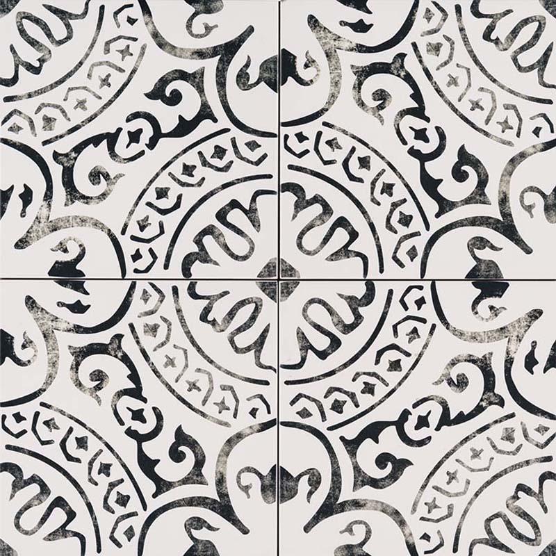 A nod to encaustic tile, Paloma is a perfect complement to black and white design.
A black and white patterned tile—like those featured in our Kenzzi Collection—transforms a monochromatic space with a graphic punch. Emily said, “In a dual-tone room, introducing a patterned floor and wall tile like Paloma dials up the drama and character – especially when paired with the classic simplicity of a subway tile.” Patterned rugs, towels, and artwork create cohesion around the encaustic look.
White Loves Black. Black Loves White.
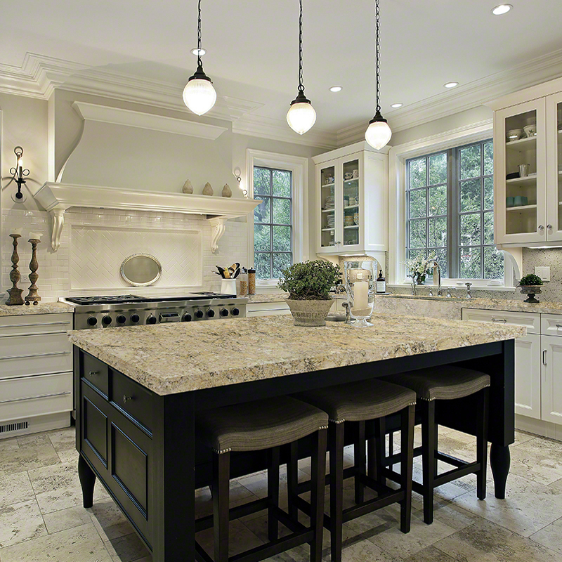
Look what happens when you mix Silver Travertine Outdoor Tiles on the floor with two-toned cabinetry and Statuary Venato Marble countertops. Leaves us spellbound.
Feel like a fledgling when it comes to design? Emily suggests black and white, "By sidestepping the color wheel, you also avoid all the overwhelming considerations it presents—like how each hue will flow effortlessly throughout your home. The palette is neutral so everything works together to create a super chic space.” The good news? There are no rules with this pairing. Trust your instincts.
Back to Business
 Modern monochrome heaven, with a little help from Zebrino Black Polished, a standout in our STILE collection.
This sophisticated couple is just as compelling at the office. A black and white backdrop is simple and timeless in rustic and refined workspaces alike. For guests and worker bees, colorful spaces can be distracting. The alternative happens to pair beautifully with everything – down to the stapler —so work zones look tidy, fresh, and sleek. Have a small office? Emily says, “White walls and pale floors make a room appear more spacious.”
