Dreamy Kitchens
June 18, 2019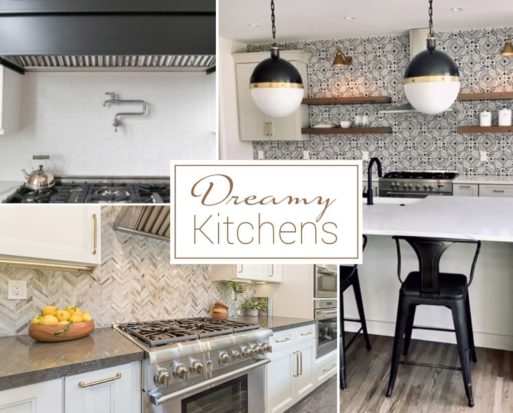
Every once in a while, Emily Holle, our Director of Trend & Design, stops mid-scroll on Instagram for a double take. Like the rest of her team, she lives and breathes design and appreciates the thought, planning, and imagination that go into dreamy spaces. And because storybook looks deserve a proper fan base, she shares them with us so we can drink in every like-able inch.
Recently, she happened upon not one but three kitchens that captured her fancy. When you look at these buzz-worthy images, you'll understand why her curiosity led to conversations. Four weeks and three inspiring stories later, each interior designer shared how their kitchen project unfolded. Um, our kind of summer beach read!
Each room calms the senses yet excites us at the same time, a.k.a., our happy place. Symmetry. Scale only a pro can pull off. Modern meets classic influences. And, of course, trendsetting surfaces—including a few of ours. Thanks to Tiffany Gowler, partners Irene Navarro and Kristine Stearns, and Molly Hanlin, visions of loveliness are heading your way — with tips of the trade to boot. If you're embarking on a kitchen renovation or lust after all things home, hold on to your heart!

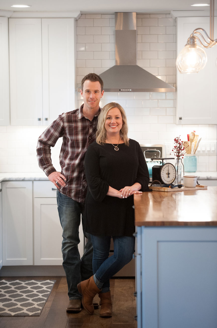
Tiffany Gowler - Shown below with her husband, Matt, meet Tiffany, the blonder half of the husband and wife builder/designer team at Gowler Homes. She joins the other moms in this post as they make the whole having it all thing seem magic-show easy. Designer by day, herder of four kids by night, this kitchen project is personal because it’s the heart of the couple’s new home – which they recently designed and built from the ground up on their 40-acre Colorado farm.
Q: Every project begins with a spark of inspiration, what was yours for this kitchen?
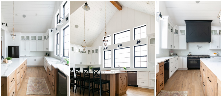
A: I had a vision of a kitchen with vaulted ceilings – a feature we designed our home around. Along with massive windows— which brings the beauty of the outdoors in—the space has an inspired, expansive feel. We also love to entertain family and friends. Guests tend to congregate where the food is. So we designed a kitchen/dining area with plenty of places to sit and mill about along with ample countertops to serve up our favorite farm-to-table dishes.
Q: How did you work through your kitchen design process?
A: My husband and I sat down and sketched out exactly how we wanted the kitchen to look. We have great fun designing homes together as part of our day job – our family home was no exception. We put our dreams into the layouts and sketches and gave them to our architect —who arranged everything to our specifications. All we had to do was choose materials and build!
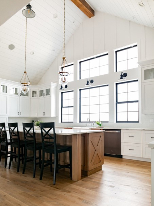
Large, open, and bathed in light, The Gowler’s modern farmhouse style takes our breath away.
Q: Was there ever a mood board for the project?
A: We use them a bit differently. Once we select materials, I place them in a collective photo – one we can refer back to throughout the entire design process.
Q: What do you love most about your kitchen?
A: I love it all! From the white brick backsplash to the massive 60” range to the island and the farmhouse sink. But my absolute favorite part is the incredible view of Pikes Peak!
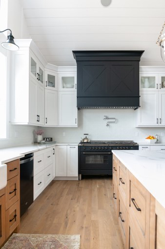
Scandi vibes? Check! White and wood cabinets provide fabulous contrast to the black appliances and hardware.
Q: What’s your process for choosing materials?
A: We work with a local showroom, Prosource Wholesale in Colorado Springs. I’ll order samples of looks I like and narrow it down. I spotted a white brick backsplash on someone’s Instagram and had to have it! Little did I know that finding the right tile would be the biggest frustration of the project.
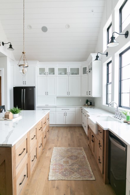
This angle shows off the scale of this stunning custom-built beechwood 10-foot long island – or shall we say, continent?
Many had textures that were rough and impossible to clean. Others had undertones too blue, creamy, or yellow. When the White Capella Brick sample came in, it was spot-on. In addition to the pure white color, it looks and feels like real brick. Then came the Gowler kitchen tile test: which is just me pouring ketchup and oil over the surface. The porcelain cleaned up like a dream. At last, a winner!
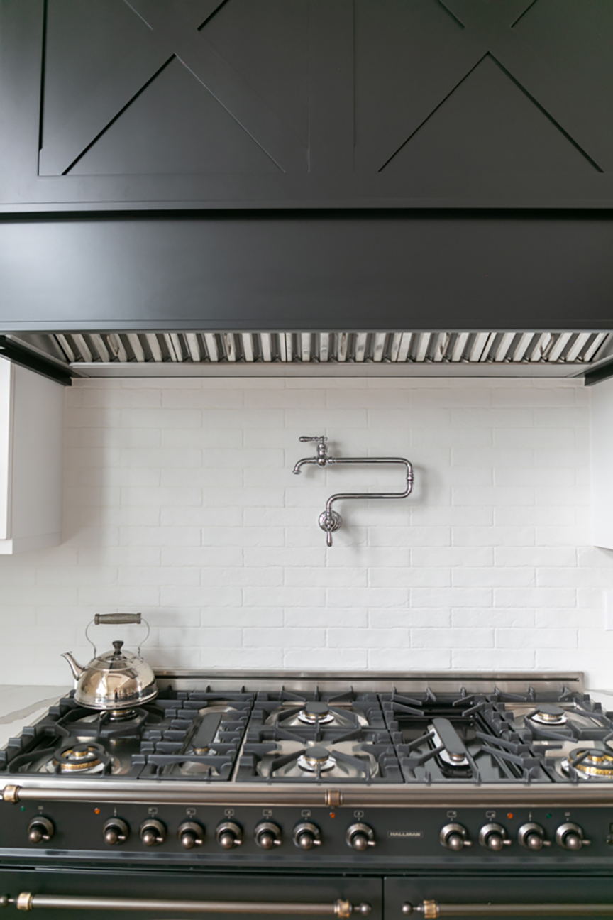 Capella Brick in White, with a custom black hood, pot filler, and a graphite Hallman Industries range with bronze trim.
Tiffany’s Top Kitchen Reno Tips
1. Go with what YOU love. Not what magazine editors or HGTV designers love. Or the looks that are saturating Pinterest.
2. Trust your FIRST instincts! For example, when picking out quartz countertops, my clients are usually drawn to a specific one from the get-go. But then they second guess themselves and spend oodles of time looking. And looking. And looking. They usually end up with their first choice!
3. In the KITCHEN, choose materials that don’t stain – products with a word-of-mouth reputation for being durable, kid-friendly, and easy to maintain.
4. Don’t know what you LOVE? Rely on your designer. It’s why you hired them.

Kristine Stearns & Irene Navarro - Kristine Stearns and Irene Navarro (shown left to right) created Southern California’s Stearns Navarro Interiors ten years ago. One-time SDSU sorority sisters, they lost touch after college only to reconnect by fate many years later in an interior design class. From the looks of this kitchen, their collaboration has been wildly successful.
Q: Why do you think kitchens are the heart of the home?
A: Just like millions of others across America, it’s the central gathering space for our families – the place we take our meals and come together at the start and end of the day. We love our dining rooms, but we’d rather skip the coasters as our day to day lifestyles are more unbuttoned. At the same time, kitchens are sacred to us - important moments happen there! We remember our mothers preparing our favorite meals and baking cookies after school. Those expressions of love stay with you. Now that we’re moms, we love recreating the same memories.
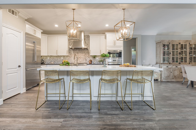
To achieve a dose of glam on their client’s wish list, the two chose gold accents on lighting fixtures, barstools, and hardware.
Q: What served as the inspiration for your kitchen project?
A: Our client spotted Calcutta Laza Quartz countertops in a photo and was smitten – we took her to a local MSI showroom to see the entire slab. It was a definite go, so we installed it on the island and designed the rest of the kitchen around it.
Q: We’re smitten, too. What’s your favorite thing about the kitchen?
A: From the backsplash and countertops to the pendants and hardware, the finishes and surfaces blend harmoniously— nothing competes for attention. It's equal parts dramatic, organic, and luxe. As the eye dances across the room - each element adds another layer of depth. On the practical side, our client cooks daily with her daughter in tow and hosts weekly socials, so we chose kid-friendly materials that rank high in cleanability.
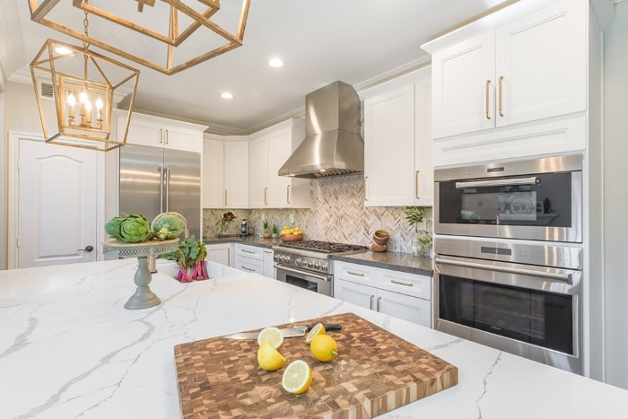
The homeowner, a cosmetic rep, hosts product parties on the regular, and guests gather around the large island. If someone spills a glass of red reaching for the latest lipstick? Refill the Cabernet first; the Q Premium Natural Quartz countertop (Calacatta Laza) can wait.
Q: What kind of design tools do you use?
A: Many clients aren’t visual, so we develop digital presentations, which include 2D CAD drawings and 3D renderings with different possibilities/evaluations. Once the layout, design, and timeline are approved, we shop for materials. The physical transformation soon follows.
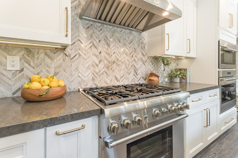
Wolf Range; Babylon Gray Quartz counters; and Palisandro Chevron Polished on the backsplash. Come to mama!
Q: What do you do when clients have no idea what they like?
A: For us, MSI showrooms are Disneyland. We take our clients on a field trip there to show them what’s possible. From quartz and stone slabs to beautiful backsplashes and LVT, it’s 10,000 square feet of inspiration. Be prepared to be amazed – a mechanical crane picks up massive stone and quartz slabs like they’re marshmallows. It's an event.
Q: Now that we have s’mores on the brain, what’s cooking in this kitchen?
A: The homeowner loves making Asian dishes, so we custom-built a hidden rice cooker cabinet. When not in use, the pull-out/lift-up design keeps her counters uncluttered.
Kristine & Irene’s Top Kitchen Reno Tips
1. If you’re not hiring a designer, Do Your RESEARCH. There’s so much information online and in MSI’s showrooms to help you choose materials that cater to your lifestyle. Pick products you really want in your home. You have to love it.
2. To get the DREAM KITCHEN you’ve always wanted, don’t be afraid to express yourself. Speak UP! And ask lots of questions.
3. No remodel runs perfectly, so cushion your timeline and budget. Unforeseen things and change orders will happen. The more you prepare for the unexpected, the less stressed you’ll be.
4. Cheaper is usually more COSTLY. You don't have to hire the priciest contractor or buy the most expensive materials, but cutting corners often means spending more in the end. We've seen this time and again.

Molly Hanlin -After a decade of working with two different design/build firms, Molly Hanlin started her own company, Reilly Watters Interiors, in Denver. When a local builder hired Molly to design the kitchen in his spec home, she was up for the challenge. Notice how she combines vintage, modern, and classics elements as if they were made for each other. They all work together to create a timeless aesthetic. Seriously. Impressive.
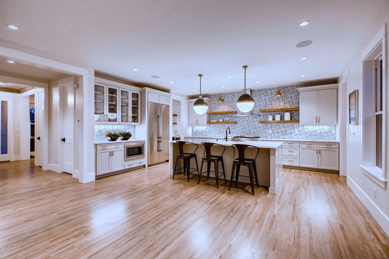
We’re gushing over the light gray cabinets, open shelving, gorgeous island (the retro chairs!) and Kenzzi Paloma Porcelain Tile Backsplash.
Q: What’s the backstory for this kitchen project?
A: My client, Laban Matthews of Solid Ground Homes, was the builder of this home. Our goal was to create a kitchen that catered to family life. He has five kids, so I kept them in mind during the design process. We share a similar design aesthetic, so collaborating with him was fun. As a bonus, it was a project that came together very quickly!
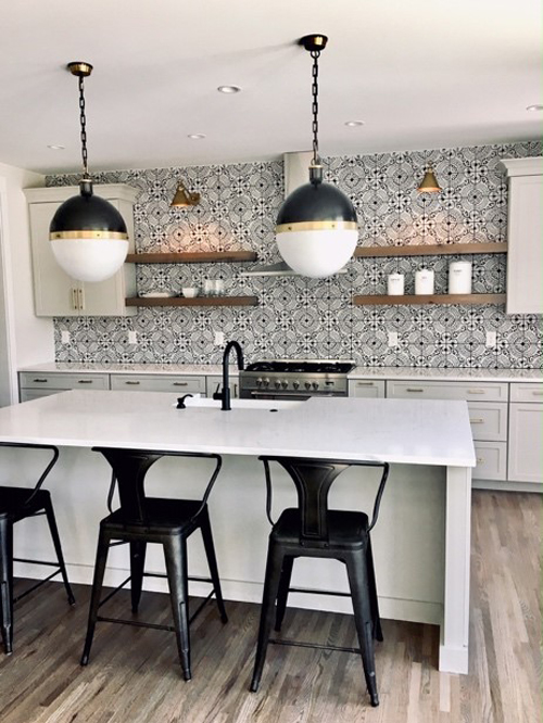
The best seats in the house.
Q: What was the inspiration?
A: We had an urban farmhouse look in mind. I was at the Floor Club in Denver, my local showroom, working on another project when the Kenzzi Paloma tile display caught my eye across the room. Closeup, I loved it more because it has an aged look – it was perfect for the backsplash. Who knew that an unexpected find would drive the material selection for the rest of the kitchen!? To balance the drama and warm up the room, I paired it with pale gray cabinets, floating wood shelves, and black and brass fixtures.
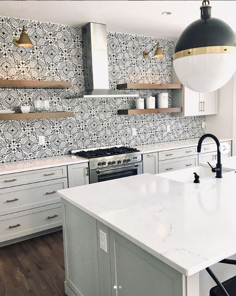
We’d never eat out again.
Q: How is designing on spec different?
A: Going with bold finishes was risky. We debated back and forth about whether or not we should tone it down to appeal to more people. I’m so happy we went with our gut because it sold immediately!
Q: What’s your favorite thing about this kitchen?
A: The whimsy! The tile backsplash sets the stage, and when combined with custom cabinets, white countertops, and oversized pendant lights, it’s cheerful and inviting. Also, flow is so important. The kitchen opens up to a large family room with over-sized sliding doors that lead to a terrace.
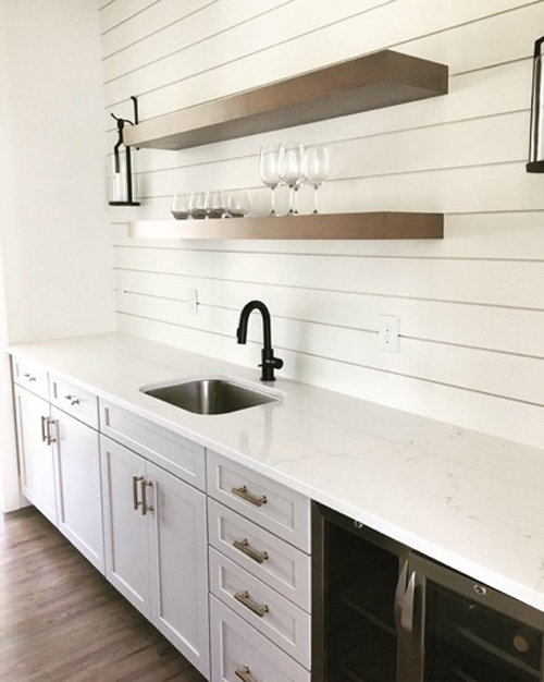
A pantry for the ages: Shiplap walls, wipe-it-down-and-go quartz countertops, and a wine fridge.
Q: What’s inspiring you right now in the kitchen design world?
A: My favorite trend is adding warmth to a classic white kitchen by using brass hardware and fixtures and adding texture through wood accents on islands, hoods, ceilings, and open shelves. There are also great finishes out there that look expensive but aren’t — like quartz with white marble looks.
Molly’s Top Kitchen Reno Tips
1. Keep MAINTENANCE in mind when selecting surfaces. Marble, for example, looks stunning in a kitchen, but you need to maintain it, and be Ok with stains and scratches over time. For a durable yet lower maintenance surface that won’t scratch or stain— I prefer quartz.
2. Think about how you’ll use your KITCHEN and lay it out accordingly – don’t forget wide walkways.
3. Add interesting DETAILS like glass cabinet doors, open shelving, or even a ceiling detail. (Remember to select finishes with the longest lead-time first.)
4. Go with the FLOW. Solving problems on the fly is why the design process is so creative. Many of my favorite elements are born out of a mistake.
Have a project with our product you’d like to share with us? Tag us with #msisighting and #msisurfaces. You never know who you’ll inspire. We may feature you here or in our Instagram feed.
